
Here is an extensive tutorial on how you can create a great looking web 2.0 logo (like the one above that I created for the tutorial). Open Adobe Photoshop and create a new file (file>new): 4500×4000 pixels at 300dpi is a nice resolution to choose if you want your logo to be printable. It will be nice to choose this resolution also for this tutorial to have the same output with stroke points and other blending options that are affected by image size.
- Choose the type tool and type anything you want in uppercase (I typed Typpz as you see :)). Duplicate the layer (right click on the type layer you created>duplicate layer).
- Choose the new Type Copy layer (in my case Typpz Copy as I typed Typpz) and right click>blending options.
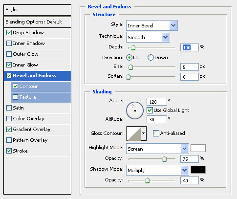
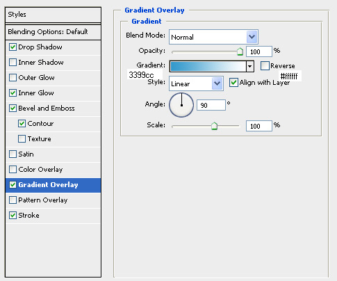
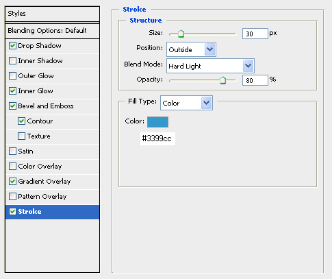
- Apply Drop Shadow, Inner Glow, Bevel and Emboss (with Contour), Gradient Overlay and Stroke with the setting you see in the screenshots below.


- Select the eliptical Marquee Tool and draw an eclipse like the one below. Create a new layer and fill the eclipse with white color (#ffffff) using the paint bucket tool. Set the opacity for the white filled eclipse layer to 30%.

- Choose the Type layer (not the copy one that you were working on in steps 2-3) and click edit>tranform>flip vertical.
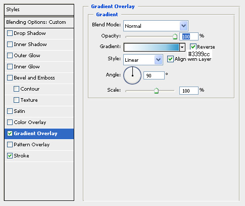
- Using the move tool or your keybord bring the fliped layer exactly below the type copy layer, so letter ends are touching each other like in my logo and then right click on type layer>blending options and apply the setting for gradient overlay and stroke as you see them in the screenshots below. Set the layer opacity to 40%.

- Now lets create the beta drop. Choose the type tool and select the Windings font. Type shift+s and then right click on this layer (its name should be “S”)>blending options and apply drop shadow, gradient overlay and stroke as you see them below.


- Choose type tool and type beta (or anything you want) and place the layer inside the drop as in my logo. Change the text color to white (#ffffff).
- Select the Type layer (the typpz layer for my tutorial-not the copy one!) and select layer>arrange>bring to front.
Your logo is now ready. Here you can download the .psd source file (lower resolution than the one I used for the tutorial because the default file was huge) to see the result and help you build something similar. The colors I used for the logo are printed on the screenshots. Here is the second part of Web 2.0 logo creation tutorials.
UPDATE: Video guide for this tutorial is available.
Nice work, interesting workthrough – see you on iconbuffet 🙂
Hey nice tut! Now if I didn’t have psp instead of ps I’d be a happy camera. Going to see if I can do the same though. Thanks for taking the time to create this!
Awesome tutorial! Thanks for sharing!
Great tutorial. But how do I save the image for use on the Web. 4000px is way too large, but I can’t figure out how to retain the same effect with a smaller pixel size suitable for a website logo.
On Photoshop you click image>image size, put the image down to 500px for example and then click file>save for web and save to png or jpg file.
Are we free to use this logo on our websites?
@grafix: As the CC License mentions, you are free to use the logo (by replacing Typpz text with your text) as long as you provide a link back here (attribution).
Thats a really cool guide! Screenshots helped me a lot 😉 Well done pals!
Really helpfull workflow. Helped me design my firsto logo (tried to design… :-))
What Font do you use???
I tried the video tut but it wont load!!!!
Plz help.
Charlie.
The font I used is a commercial one. You can find similar rounded fonts free for download here.
Thanks for the help,
I used a font called TANTOR and just stretched it upwards.
Charlie.
Thats a great tutorial guys! Thanks a lot for sharing with us! 🙂
I couldn’t understand some parts of this article e a Web 2.0 logo using Abobe Photoshop, but I guess I just need to check some more resources regarding this, because it sounds interesting.
very interesting, but I don’t agree with you
Idetrorce
These settings are way out if youre going to do a tutorial might as well give us the real settings !!!
@Jamie: Settings are exactly those that I used for the output you see 😉
make more tutorials like this one please 🙂
Perfect tutorial!
Pretty simple.. Not a bad effect though… Although a layer mask on the highlight overlay might have made it a bit better looking.
Nice tutorial thanks. What is the name of this commercial font? Please! 🙂
@Frank: Its called anja eliane and can be found for free (for non commercial use) on http://urbanfonts.com 😉
Excellent tutorial and just what I was looking for. I too am trying to save for the web, but have specific dimensions i.e. 360px by 55px, 55px by 55px – when I save, I lose the drop shadow and it gets incredibly pixely. Warning, I am new to all of this. 🙂 OK so new that why is everything now referred to as Web 2.0?
Cindy
@Cindy Before you save for web you should merge down all layers (all layers will become one layer) and you will not lose the shadow effect! This logos are modern and used in many web 2.0 sites, that’s why they are called web 2.0 logos!
can u let me known the easiest way to create the logo for a particular site . kindly provide us the softawre through which i can easily download the softawre and run accordng to it there task . kindly help me out to create the logo . once the logo is created how should i replace the original logon into the new logo.
Great tutorials. This is just what I’m looking for. I’d like to create a custom logo for my blog. Thanks.
Nice logo, I will try to make this type of logo for my site. thanks.
good work i wll use it at my site rhank you
joss work